Before the establishment of standardized systems for categorizing famine, such as FEWS NET and the Integrated Food Security Phase Classification (IPC), early hunger maps were used to visualize food insecurity and famine across the world. Mapping the state of hunger in a country through maps is a century old practice. The ability to visualize the scope of hunger has been an important tool to mobilize public support for humanitarian aid and to grasp the geography of need.
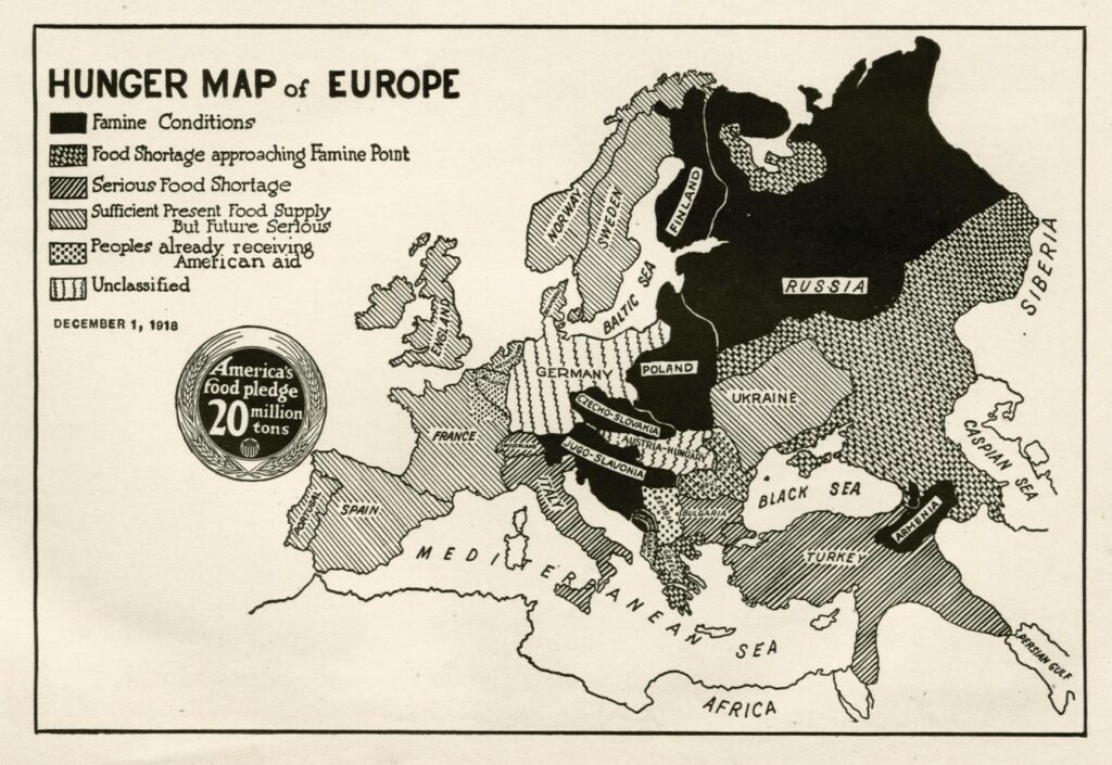
Between the late nineteenth and mid-twentieth centuries, famine maps circulated through colonial commissions and postwar relief agencies as tools of control, knowledge, and influence. An example is the above map which was featured in a 1918 pamphlet created by the US Food Administration (precursor of the FDA) to show American children how European nations were suffering from food shortages and how American aid could bridge the gap.

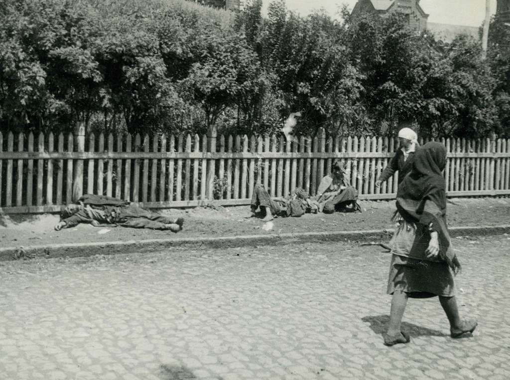
A second example is the “Famine in USSR” map, which accompanied a piece titled Famine in Russia by Aleksandr Prokofʹevich Markov (1934) to depict the severity of food shortages across the Soviet Union, mainly Ukraine, during the early 1930s famine.
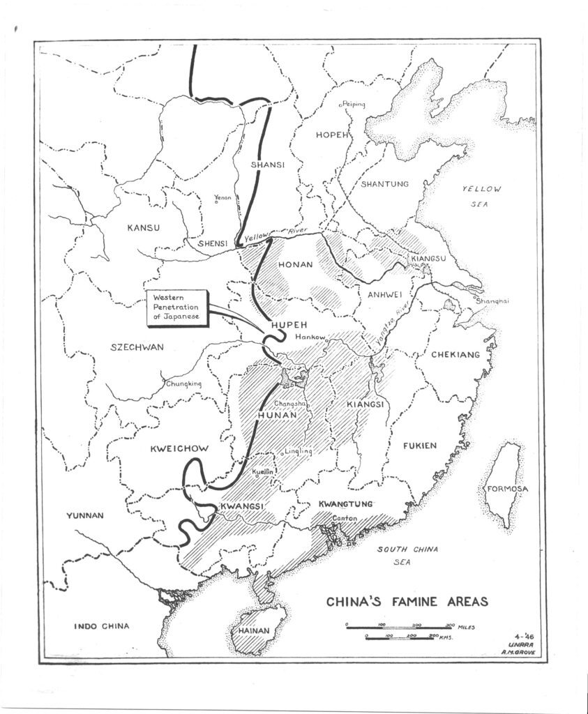
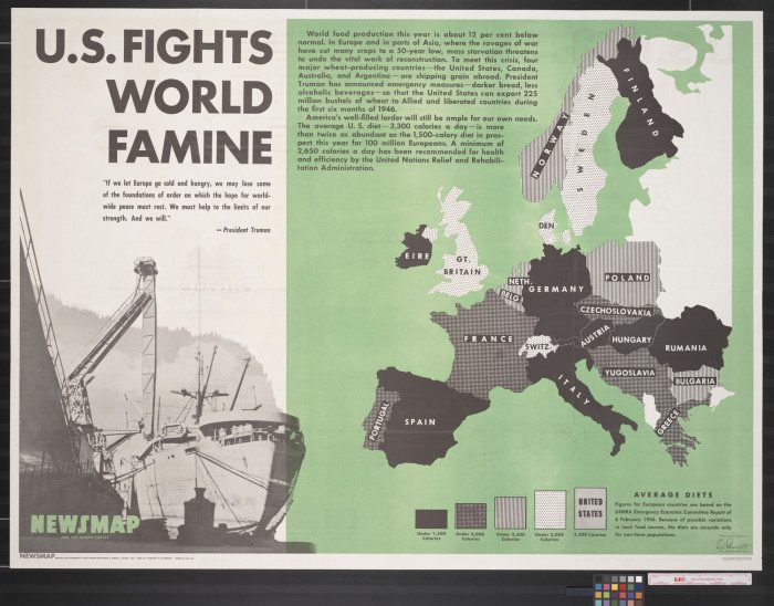
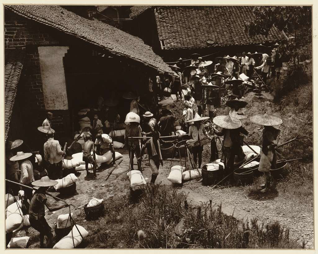
With growing international collaboration on humanitarian needs during and after World War II, data collection and sharing came to practice from new international organizations, most notably the United Nations Relief and Rehabilitation Administration (UNRRA), the predecessor to the modern United Nations. This data was used to map famine conditions for relief efforts and appeared in public media, such as the maps above, which illustrated areas of caloric deficit across China and Europe to encourage American support for the fight against famine.
These types of maps were consequential for laying the groundwork for the more robust food security data of today, where they still inform both humanitarian intervention and public awareness.