How can we compare the famines in Sudan and Gaza? Comparing extreme human suffering is invidious. It invites saying one is ‘worse’, and therefore the other is not as ‘bad.’ The experience of starvation, for its victims and survivors, cannot be captured by any numbers.
In this blog post, we use the data from the Integrated Food Security Phase Classification (IPC) to explore different dimensions on which famines and food emergencies can be measured.
We draw upon the IPC’s population tracking tool, and for comparative purposes, include all the cases where the IPC’s Famine Review Committee (FRC) has been convened to review the data and determine whether there is a prospect that ‘famine’ thresholds will be crossed.
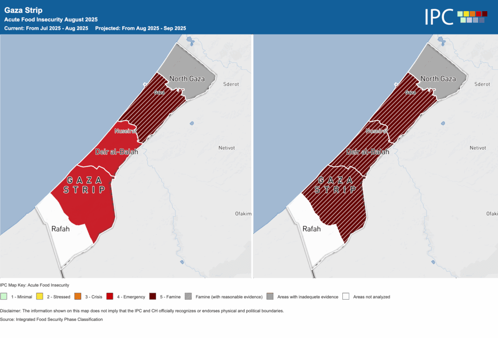
The IPC’s maps provide a compelling visualization of the geography of food emergencies.
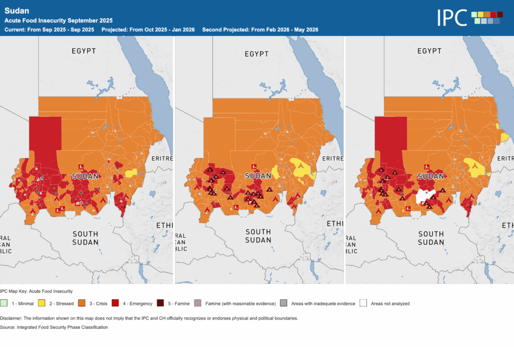
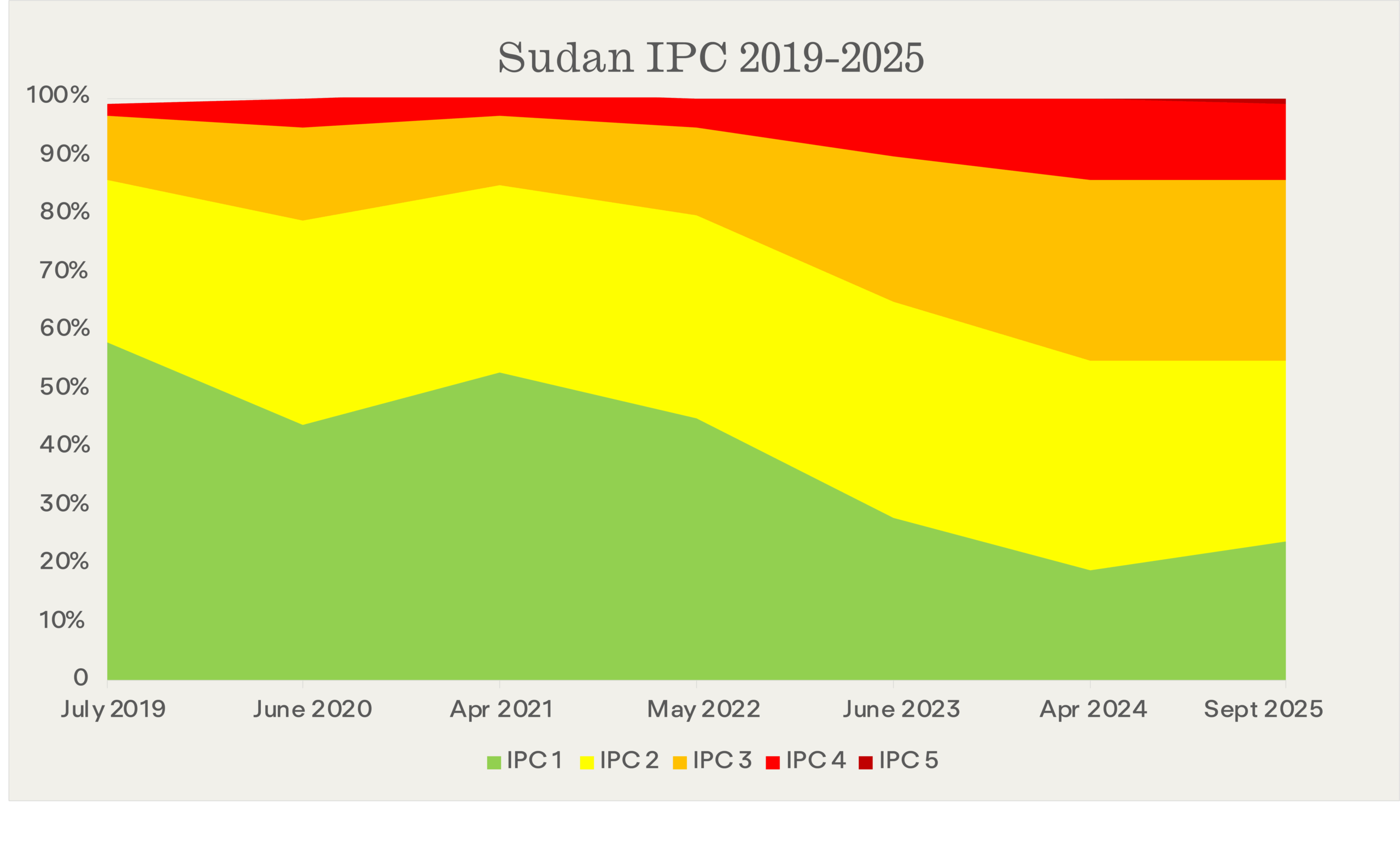
These only tell part of the story. The following two figures show trajectories into famine. In Sudan there is a slow descent. In parts of the country, famine conditions were determined in April 2024, though they had likely existed for some time prior.
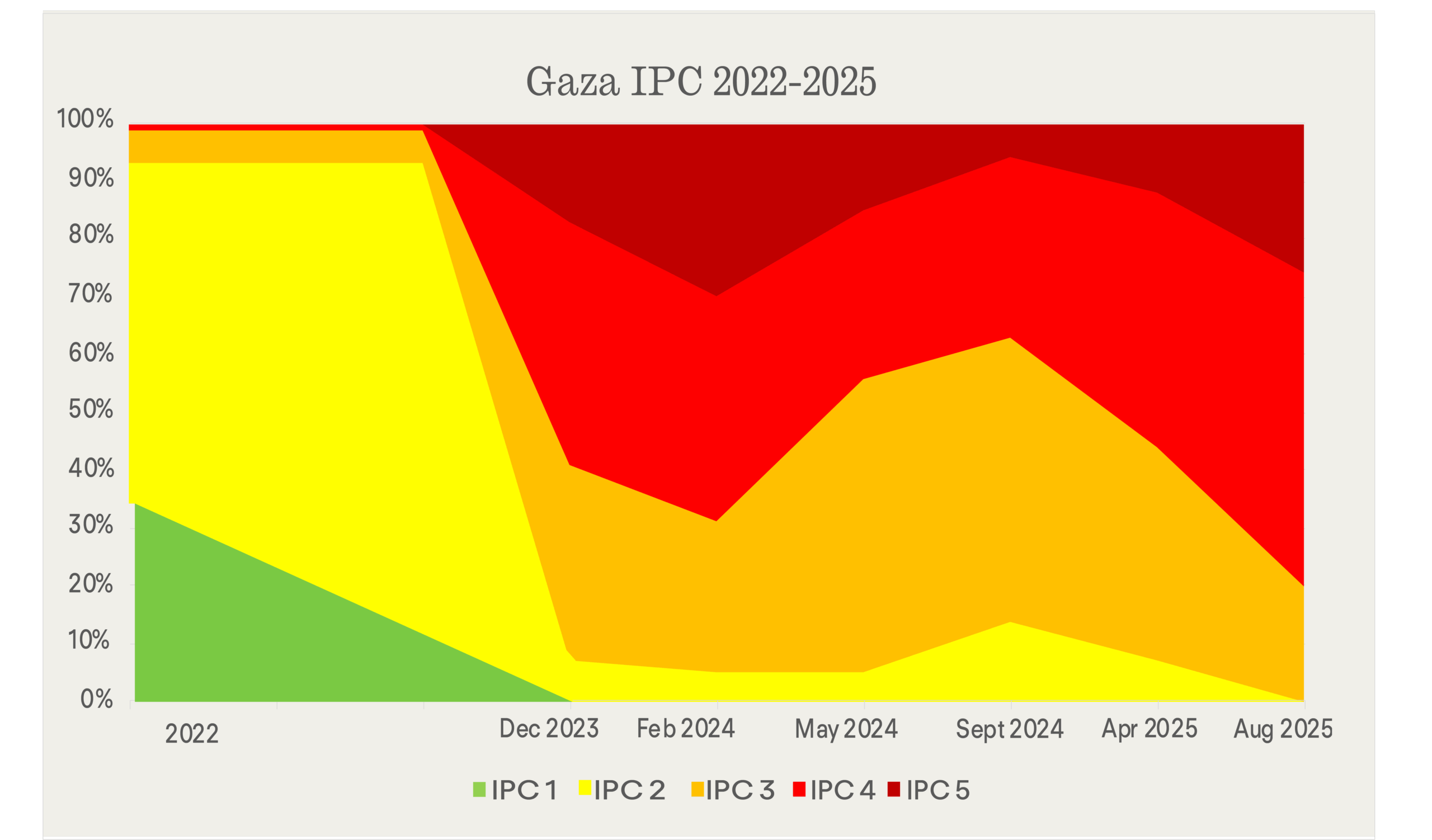
In Gaza there is a distinctly different pattern: a very sharp decline followed by fluctuations just short of the ‘famine’ threshold, until that threshold was crossed in July/August this year.
Humanitarian disasters don’t fall neatly into ‘famine’ and ‘non-famine’. The IPC measures the severity of the crisis by location. But this doesn’t capture the magnitude of the crisis—number of people affected, final aggregate death toll, the varying levels of classification throughout a country. The following two figures try to represent these dimensions of the crisis, covering all the 22 cases reviewed by the FRC (plus Somalia in 2011, before the FRC was set up).
The horizontal axis shows magnitude: the total number of people in the IPC categories. The vertical axis shows severity: the percentage of the people in those categories in the worst hit location. The red spots are the cases in which the IPC FRC determined ‘famine’. Figure 5 does this for IPC phases 4 and 5, Figure 6 for IPC phase 5 only.
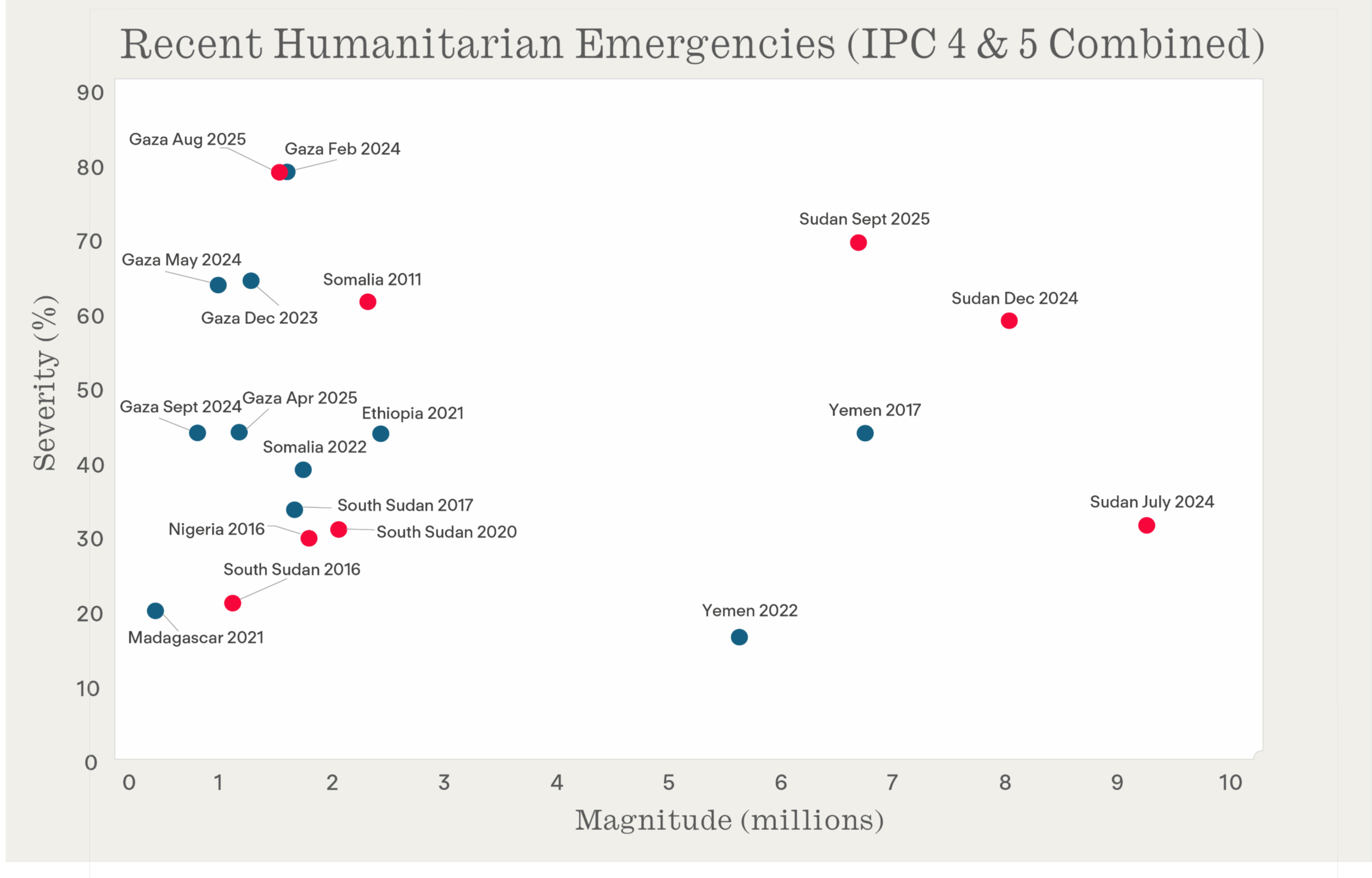
What this figure makes clear is that Sudan is the worst by magnitude, with Yemen coming close. Gaza, Sudan and Somalia (2011) had the most severely affected locations. It’s also evident that there’s no simple correspondence between these metrics and the ‘famine’ determination. There are cases of very high numbers, and considerable severity, in which the specific threshold for ‘famine’ wasn’t crossed—or to be precise, the data weren’t available for the FRC to conclude, with confidence, that it had been crossed.
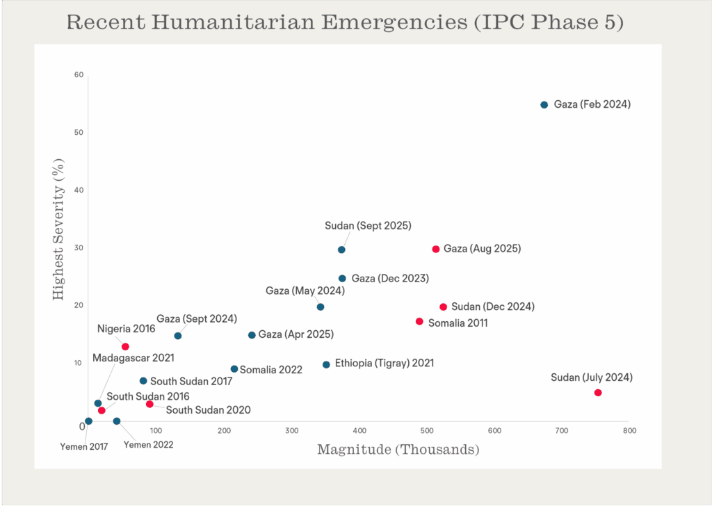
This figure makes clear the same points as before, only more starkly. What stands out the Gaza in February of 2024. 55% of the population in the North Gaza and Gaza governates were categorized in phase 5, but the famine threshold was not passed. We can also see on two different ends of the graph that famine was determined, proving again the relationship between the metrics used for measurement and the ‘famine’ determination is not clear-cut.
People who go through famine, extreme food emergencies and related catastrophes are increasingly critical of the way in which the IPC metrics reduce their experiences to numbers. What these figures confirm is that even when we stick with numbers alone, we need to move beyond thinking about famine/non-famine.