It’s an intuitively obvious link: world food crises cause famines. Look closer and it’s not so clear.
Let me present two figures, one for global food prices from 1870 to 2020 and the other for famine deaths for the same period. Both show long-term declines.
Figure 1: Wheat, Rice and Corn (maize) prices 1872-2020
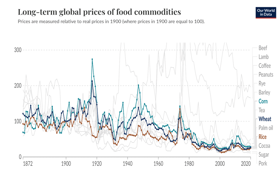
In this and the following figures, prices are indexed to real prices, with 1900 being 100.
Figure 2: Global risk of death in famine by decade
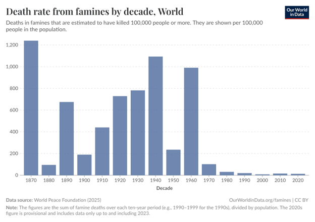
There are some big fluctuations—notably the massive increase in 1960 due to the ‘Great Leap Forward’ famine in China. The overall trend line is in the same direction. But what of the fluctuations?
The next figure plots the price of wheat against the number of famine episodes (not the aggregate mortality) over the same period.
Figure 3: Global wheat price and number of famine episodes
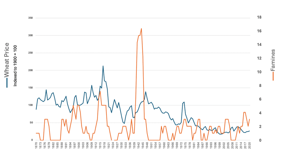
It looks like there are some periods when a higher number famines coincided with increased wheat prices, such as 1912-18, 1939-46 and 1973-74, while fewer famines coincided with declining prices, such as the 1920s and 1950-60s. The earlier and later periods are harder to read. So let’s examine those periods.
In the decades 1870s-1930s, the price of rice often didn’t move the same way as wheat (look back at figure 1 and how the prices diverged in the 1910s). And given that rice is the staple for most of Asia, let’s look more closely at rice prices and Asian famine numbers (excluding Middle Eastern countries, and for the 1958-62 China famine, counting the provinces affected individually). This is shown in figure 4.
Figure 4: Global Rice Prices and Famines in Asia
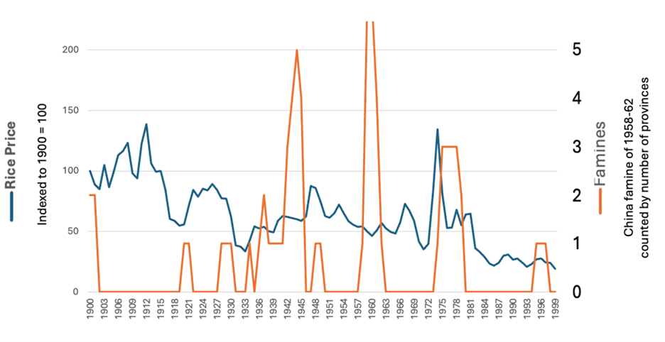
Apart from the 1970s, this doesn’t show obvious associations. The most likely reason is that for most of the period up to 1950, and for China and Cambodia until the 1980s, the famine-vulnerable countries weren’t well-integrated into global food markets, because of war or government policy. In fact, the great Chinese famine under Mao occurred in part precisely because the country was cut off from international markets.
Let’s turn to the more recent period. Figure 5 shows global food prices over the last 40 years.
Figure 5: Wheat, Rice and Corn (maize) prices 1983-2020
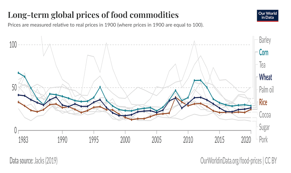
Although the price peaks are modest by historical standards, this graph clearly shows the ‘global food crises’ of 2008 and 2011. Now, focusing on the years since 2000, let us combine those prices with recent famine episodes.
Figure 6: Global food prices and famines 2000-2020
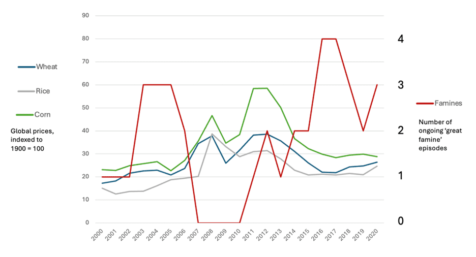
The increase from zero famines in 2010 to two in 2012 (Somalia and Syria) followed the 2010-11 food price increase. And indeed in both cases, food price increases were one factor, along with others, in those episodes of starvation. But the wider story is that the ‘world food crises’ didn’t lead to increased numbers of great famines.
This confirms that in most cases the drivers of famine are other than world food prices.